Measured guide · in-house test data
How to Create an ICO Favicon from a PNG Logo
A favicon is an identification mark, not a miniature poster. Simple geometry, high contrast, and limited detail matter more than a large source resolution once the result is displayed around 16 or 32 pixels.
By Prashantkumar Kishanrao Sundge · Published · Reviewed
What this guide establishes
- Design for 16 pixels, not for the size you are looking at. Almost everything that fails does so because it was judged at 500%.
- ICO is a container holding several icon sizes at once, which is why its byte size is not comparable to a single PNG.
- Your full logo is usually the wrong favicon. Use one symbol, one letter, or a simplified mark.
- Transparency helps, but check the mark against both light and dark browser themes before committing.
- Browsers cache favicons aggressively. Testing an update needs a hard refresh, a private window, or a changed filename.
What a favicon has to survive
A favicon is displayed at roughly 16 by 16 pixels in a browser tab. That is 256 pixels in total — fewer pixels than the first paragraph of this page uses for a single letter. Everything about favicon design follows from that number.
The same file is also used at larger sizes in other places: bookmark lists, history entries, the address bar on some browsers, pinned tabs, mobile home-screen shortcuts, and the desktop shortcut icon on Windows. Those range from 16 up to 256 pixels. This is why the ICO format holds several sizes at once rather than one — the software picks whichever embedded size fits its display slot, instead of scaling a single image badly.
Judging the design at any size other than the one it will be displayed at is the near-universal mistake. A mark that looks clean and detailed at 400 pixels on your screen may be an unrecognisable smudge at 16. The only reliable test is to look at it at actual size, in an actual browser tab.
Simplify before conversion
Start with a square PNG and crop unnecessary transparent margins. Use a symbol rather than a long wordmark. Thin strokes, small lettering, and subtle gradients can disappear when sampled down.
Inspect the PNG on both light and dark backgrounds. Transparency is useful, but an edge that depends on one page color may vanish in another browser theme.
Be ruthless about what to remove. A company logo that combines a symbol with the company name should usually become just the symbol. A symbol with three colours and an inner detail should often become two colours and no inner detail. A wordmark with no symbol may need to become a single initial. This feels like a loss of brand fidelity, but a mark nobody can identify at tab size has already lost the brand entirely.
Cropping the margins matters more than it seems. If your source PNG has the mark floating in the middle of a large transparent canvas, the mark itself occupies only a fraction of the final 16 pixels. Crop tight to the artwork so every available pixel is doing work.
Contrast is the property that survives downscaling best. A dark mark on a light ground, or the reverse, stays legible when almost everything else about the shape has been averaged away. Subtle tonal differences do not survive at all.
Build and install the ICO
The dedicated converter requests common embedded sizes from 16×16 to 256×256. The resulting ICO is a container, so its byte size is not directly comparable to one PNG canvas.
Our measured example makes the container cost visible: an 11,839-byte source PNG produced a 30,353-byte ICO. The ICO is larger because it holds multiple rendered sizes, not because anything was done inefficiently. A favicon in the tens of kilobytes is normal and is not worth optimising further.
Modern sites can also provide PNG or SVG icons through metadata, while favicon.ico remains a useful compatibility fallback. Follow your framework's favicon conventions rather than adding duplicate tags blindly.
For placement, the historical convention is a file named favicon.ico at the site root, which browsers request automatically even with no markup at all. Most current frameworks have their own convention that generates the correct markup for you — Next.js, for example, picks up an icon file placed in the app directory. Using the framework's mechanism is better than hand-writing link tags, because hand-written tags that disagree with the framework's generated ones produce confusing results.
Test where people see it
Open a local page with the favicon, bookmark it, and inspect the browser tab at normal scale. Browsers cache icons strongly, so a private window or cleared site data can help when testing an update.
The caching is worth dwelling on because it produces a specific false alarm: you replace the favicon, reload the page, see the old icon, and conclude the change did not work. It usually did. Favicons are cached separately from the page and survive an ordinary refresh. Open a private window, or navigate directly to the icon's URL and refresh that, or temporarily change the filename to force a fresh request.
Test against both browser themes. A dark mark with a transparent background looks correct in a light-themed browser and can disappear entirely against a dark tab strip. If your mark is a single dark colour, consider adding a light shape behind it or choosing a colour with enough contrast against both.
If the mark becomes unreadable, simplify the source rather than only increasing its resolution. The bottleneck is the display size.
Why a bigger source does not fix a bad favicon
This is the most persistent misunderstanding about favicons, and it is worth addressing directly. When a favicon looks wrong, the instinct is to supply a larger, higher-resolution source PNG. It almost never helps.
Downscaling to 16 pixels averages large areas of the source into single output pixels. A 1024-pixel source and a 256-pixel source of the same artwork produce nearly identical 16-pixel results, because both are being averaged down past the point where their difference matters. The information loss is in the destination size, not the source.
What does help is changing what is being averaged. A thin 2-pixel stroke in a 256-pixel design becomes an eighth of a pixel at tab size and vanishes into the background. Making that stroke thick enough that it still occupies a visible fraction at 16 pixels is a design change, not a resolution change — and it is the change that actually works.
The same applies to detail count. Three shapes in a 16-pixel space is ambitious. One shape is safe. Reduce the number of things the viewer has to resolve, and the mark survives.
Beyond favicon.ico
A complete icon set for a modern site usually involves more than one file, because different platforms want different things. Browsers will use an ICO or a PNG. Mobile devices adding a site to the home screen want a larger square PNG, typically 180 pixels or more, and often without transparency since it will be placed on a coloured tile. Some platforms read icon definitions from a web app manifest rather than from link tags.
You do not need to build all of this by hand, and you probably should not. Most frameworks generate the appropriate markup from a small number of source files, and the conventions change often enough that hand-maintained tag lists go stale. Provide the sources the framework asks for and let it produce the markup.
One rule holds across all of them: the same simplification discipline applies. A home-screen icon at 180 pixels can carry more detail than a 16-pixel favicon, but it is still an identification mark seen at a glance among dozens of others, not a place to reproduce a full logo lockup.
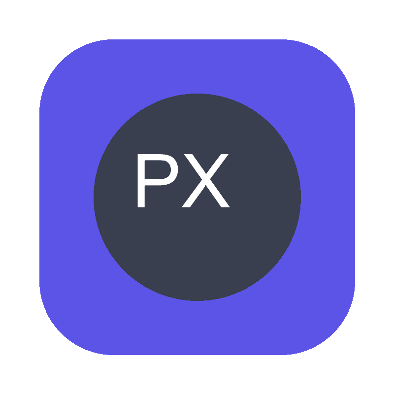
Copyright-safe 800×800 source used to generate the downloadable multi-size ICO corpus file.
- PNG source
- 11,839 bytes
- ICO container
- 30,353 bytes
- Requested sizes
- 16, 32, 48, 64, 128, 256px
Reproduce the test
These deterministic PixelConvert files contain no personal photos or third-party artwork. Download them to repeat the measurements or test another workflow.
- Download the square PNG source ↓
Copyright-safe 800×800 RGBA logo with flat shapes and strong edges.
- Download the measured ICO ↓
30,353-byte multi-size ICO generated from that source.
Browser and failure checks
- Current Chromium desktop
- The generated ICO renders in the browser tab; the flat high-contrast mark remains identifiable at tab scale.
- Icon cache behavior
- Replacing the icon without a hard refresh or private window frequently shows the previously cached icon, which is browser caching rather than a conversion failure.
- Container decode check
- The output ICO was reopened after encoding to confirm the embedded sizes decode correctly.
How this was tested
The square transparent source was created from Pillow primitives and encoded to ICO with the production list of requested sizes. The container was then opened to confirm Pillow could decode it.
Read the full PixelConvert methodology →Limitations
- Embedded-size availability can depend on source dimensions and encoder behavior.
- Browser UI rendering and caching vary; test target browsers.
- Framework favicon conventions change between releases; follow your framework's current documentation rather than a fixed list of link tags.
Frequently asked questions
- What size should my source PNG be?
- Square, and at least 256 pixels so the largest embedded size can be generated without upscaling. Larger than that adds nothing, because the result is averaged down to 16 pixels for the use that matters most.
- Why is my ICO file bigger than the PNG I made it from?
- An ICO holds several icon sizes in one container. Our measured example turned an 11,839-byte PNG into a 30,353-byte ICO. That is expected and not worth optimising.
- Can I use my full company logo as a favicon?
- Usually not well. A logo with a wordmark becomes illegible at 16 pixels. Use the symbol alone, or a single initial, and keep the colours high-contrast.
- I replaced my favicon but the browser still shows the old one.
- Favicons are cached aggressively and survive ordinary refreshes. Open a private window, hard-refresh, or change the filename to force a new request. The conversion is almost certainly fine.
- Will a higher-resolution source make my favicon sharper?
- No. Downscaling to 16 pixels averages away the extra detail regardless of where it started. If the icon is unclear, simplify the design — thicker strokes, fewer shapes, higher contrast — rather than increasing resolution.
- Do I still need favicon.ico, or can I just use a PNG?
- Modern browsers accept PNG and SVG icons declared in markup. An ICO at the site root remains a useful fallback because browsers request it automatically even with no markup present. Most frameworks handle both for you.
Revision note: Reviewed 11 September 2026: added a section on what a favicon must survive, an explanation of why larger source files do not fix small-size legibility, favicon cache-testing guidance, and coverage of home-screen icons and manifests. The ICO measurement is unchanged.